Developed a comprehensive Power BI dashboard for Ola ride analysis, tracking over 93.61K bookings and $33.46M in booking value to provide key business insights.
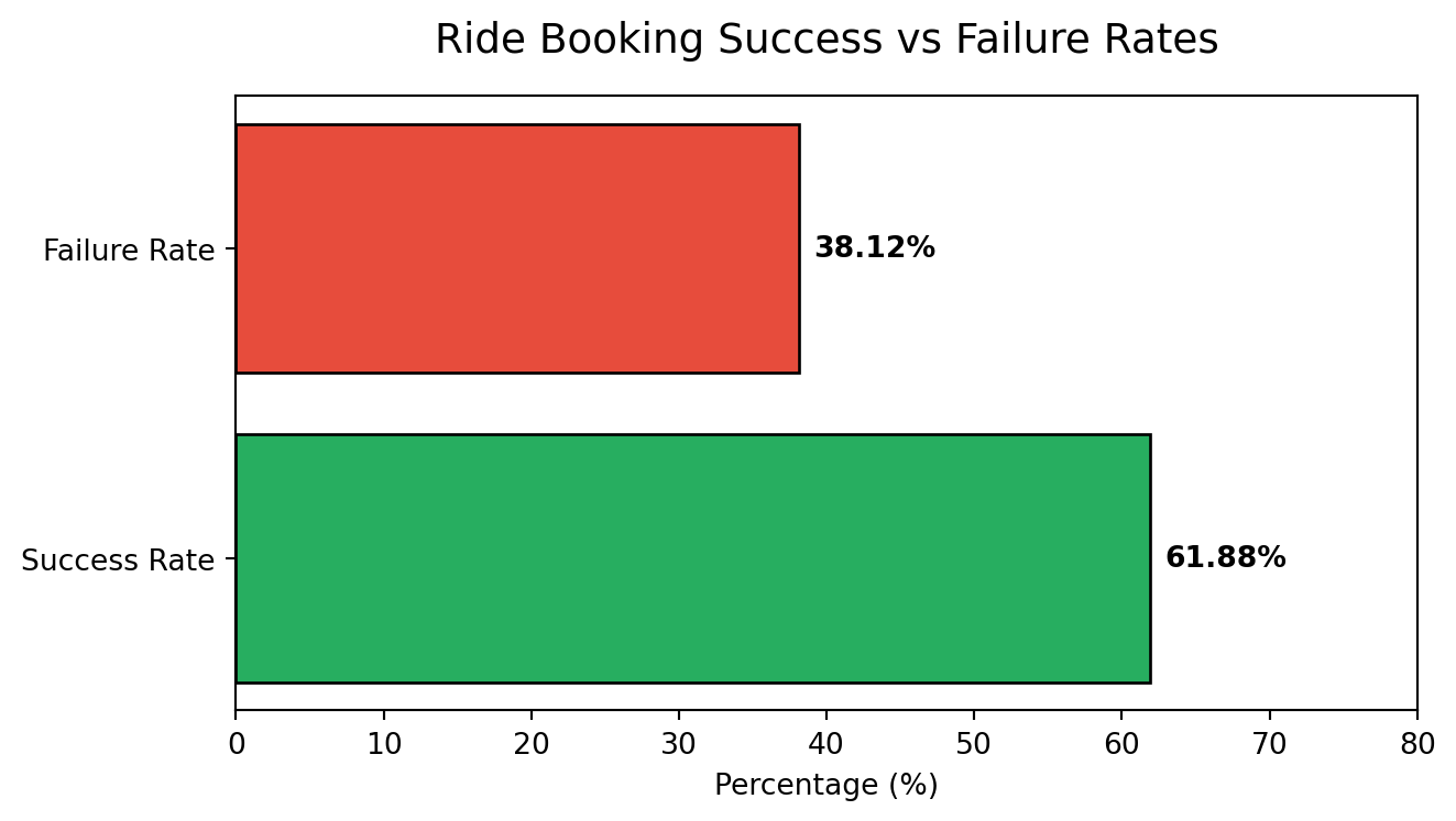
Key Deliverables: - Used MySQL queries for fast retrieval of data for stakeholder requirements on fast decision making. - Analyzed and visualized ride-sharing performance by vehicle type, identifying Prime Plus as the top revenue generator with $4.84M in booking value. - Built a detailed cancellation analysis module, highlighting that 19% of rides were customer-canceled versus 3.39% driver-canceled. - Monitored and reported on booking success rates (61.88%) and failure rates (38.12%). - Designed series of visuals including line charts for daily trends and pie charts for segmentation.
Demonstrating Success Rates with Python
To satisfy the Quarto environment requirements, I am demonstrating the Booking Success vs Failure rate logic using an embedded Python chunk.
This visualization reinforces the finding that there is a significant margin for improving operational efficiency by targeting the 38.12% failure segment.